인간 감정이 기계 논리를 만나는 곳
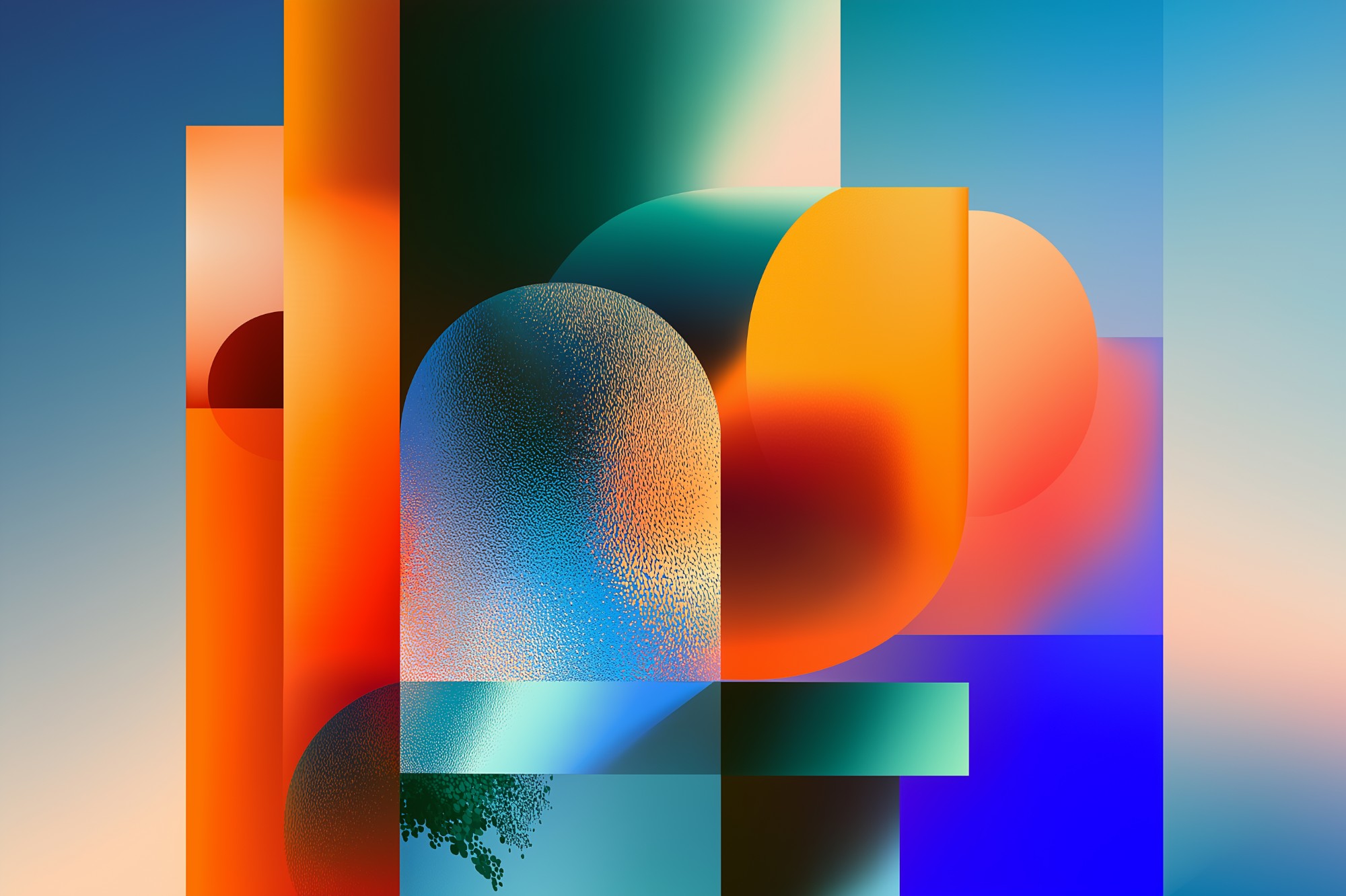
Scroll through Behance or Instagram, and you'll see them: posters with impossible geometries, dreamlike color palettes, and surreal compositions that feel both familiar and alien. These are AI-generated posters, and they're creating a new visual language. This case study explores what makes AI aesthetics unique, why they resonate, and whether machines can truly create art — or just beautiful noise.
Behance나 Instagram을 스크롤하면 볼 수 있다: 불가능한 기하학, 꿈같은 색상 팔레트, 익숙하면서도 낯선 초현실적 구성을 가진 포스터들. 이것들은 AI 생성 포스터이며, 새로운 시각 언어를 만들고 있다. 이 케이스 스터디는 AI 미학을 독특하게 만드는 것, 왜 공감하는지, 그리고 기계가 진정으로 예술을 만들 수 있는지 — 아니면 단지 아름다운 소음인지 탐구한다.
What Makes AI Posters Look "AI"?
1. Hyperrealistic Yet Impossible
AI posters often feature photorealistic elements in physically impossible arrangements:
- Glass spheres that reflect environments that don't exist
- Architecture that defies gravity
- Human forms with anatomically incorrect but aesthetically pleasing proportions
- Lighting that comes from nowhere and everywhere simultaneously
2. Uncanny Smoothness
Characteristics:
- Every surface is too perfect (no texture noise or imperfections)
- Gradients that are mathematically precise
- Shadows that feel calculated rather than observed
- Colors that are saturated beyond natural limits
Why it works: Creates a dreamlike, hyperreal quality that human designers rarely achieve (because they're constrained by physical reality).
3. The "AI Color Palette"
AI tools gravitate toward specific color combinations:
- Synthwave nostalgia: Pink/purple/cyan gradients (Miami Vice aesthetic)
- Organic pastels: Soft peach, mint, lavender
- Dramatic contrast: Pure black with neon accents
- Otherworldly gradients: Colors that don't exist in nature but feel "right"
4. Surreal Juxtaposition
AI loves combining unrelated elements in visually coherent ways:
- Classical sculptures in cyberpunk environments
- Organic forms (flowers, bodies) merging with geometric shapes
- Time period mixing (medieval + futuristic)
- Scale distortion (tiny humans, giant objects)
AI doesn't understand "rules" — it understands patterns. It creates what looks right based on training data, not what makes logical sense. This creates a new aesthetic: beautiful illogic.
The 5 Major AI Poster Trends
Trend 1: Neo-Baroque
What it is: Classical art meets digital maximalism. Ornate frames, marble textures, gold accents — but with glitch effects and impossible perspectives.
Why it's popular: Taps into nostalgia for "high art" while feeling futuristic. Luxury brands love this aesthetic.
Trend 2: Liquid Geometry
What it is: Geometric shapes that melt, flow, and morph. Hard edges softened by organic movement.
Why it's popular: Represents the fluidity of digital vs. rigid physical world. Tech startups gravitate toward this.
Trend 3: Organic Minimalism
What it is: Simple compositions with natural forms (leaves, water, clouds) rendered in soft, dreamy styles. Lots of negative space.
Why it's popular: Reaction against digital overwhelm. Wellness and lifestyle brands use this heavily.
Trend 4: Cyberpunk Nostalgia
What it is: Neon grids, chrome textures, retrofuturism. Blade Runner meets Tron. Heavy use of pink/purple/cyan.
Why it's popular: '80s/'90s nostalgia + crypto/tech culture. Gaming and NFT projects love this.
Trend 5: Abstract Emotion
What it is: Non-representational forms that evoke feelings. Swirling colors, undefined shapes, pure mood.
Why it's popular: AI excels at creating "feeling" without meaning. Music festivals and art exhibitions use this.
Human-Designed vs AI-Generated: Can You Tell the Difference?
The Experiment
Researchers showed 500 people 20 posters (10 human-designed, 10 AI-generated) and asked them to identify which was which.
Results
- Overall accuracy: 58% (barely better than random chance)
- Designers: 72% accuracy
- General public: 52% accuracy
What Designers Noticed
AI tells:
- Too-perfect gradients (no grain or noise)
- Anatomical impossibilities (fingers, eyes, reflections)
- Overly saturated colors
- Lack of intentional negative space
Human tells:
- Deliberate asymmetry
- Typography with purpose (AI text often looks "placed" not "designed")
- Conceptual cohesion (human work has a "thesis," AI has aesthetic)
- Controlled imperfection
When asked which posters they preferred (not which was human/AI), 62% chose AI-generated. They found them "more interesting," "more creative," and "more visually striking." Human posters were rated "more meaningful" but "less exciting."
How AI Creates (And Why It Matters)
Human Creative Process
- Concept: Start with idea or message
- Research: Gather references, study context
- Sketch: Rough ideas, test compositions
- Refine: Iterate based on feedback and intent
- Execute: Final production
Result: Intentional, meaningful, but constrained by skill and time.
AI Creative Process
- Prompt: Human provides text description
- Pattern matching: AI finds similar images in training data
- Synthesis: Combines patterns in novel ways
- Output: Generates image in seconds
Result: Aesthetically stunning, but potentially meaningless. No "why," only "what."
If a poster is beautiful but has no intended message, is it art or decoration? AI creates the visual language of art without the conceptual depth. Is that enough?
When to Use AI Posters (And When Not To)
| Use Case | AI Works Well? | Why / Why Not |
|---|---|---|
| Social Media Graphics | ✅ Excellent | Eye-catching, fast to produce, disposable content |
| Mood Boards | ✅ Excellent | Rapid exploration of visual directions |
| Music Festival Posters | ✅ Good | Surreal aesthetics match music culture |
| Tech Product Launches | ⚠️ Maybe | Works if brand is futuristic, fails if need clarity |
| Political Campaigns | ❌ Poor | Needs clear message, human connection, trust |
| Nonprofit Awareness | ❌ Poor | Requires empathy, storytelling, authenticity |
| Corporate Branding | ❌ Poor | Lacks strategic consistency, brand depth |
The Hybrid Approach: AI + Human = Best Results
Workflow That Works
Generate 50+ variations exploring different styles, compositions, and moods. Think of AI as your brainstorming partner.
Pick 3-5 that align with brand strategy and message. AI doesn't understand strategy — you do.
Use AI outputs as base. Bring into Photoshop/Illustrator. Add typography, adjust composition, inject intention. The AI provides raw material; you shape it.
Fix AI artifacts (weird hands, impossible reflections). Add brand elements. Ensure accessibility. This is where craft matters.
Spotify's "Wrapped 2024" campaign used Midjourney to generate thousands of abstract backgrounds. Human designers selected the best, added user data visualizations, and refined typography. Result: AI speed + human intention = culturally viral campaign.
The Debate: Is AI Art Actually Art?
Arguments Against
- "No intention:" Art requires human intent and emotion. AI has neither.
- "Not original:" AI remixes existing work. True art creates something new.
- "Too easy:" Art requires struggle, learning, mastery. Typing a prompt isn't craft.
- "No soul:" Beautiful, yes. But empty. Decoration, not communication.
Arguments For
- "New medium:" Photography was once dismissed as "not real art." AI is just the next tool.
- "Prompt as craft:" Writing effective prompts requires skill, vision, iteration. That's authorship.
- "Democratization:" Art shouldn't be gatekept by technical skill. Ideas matter more.
- "Collaboration:" Humans + AI create things neither could alone. That's art.
Perhaps the question is wrong. AI posters aren't "art" or "not art" — they're a new category. Visual content that prioritizes aesthetic impact over conceptual depth. Not better or worse. Different.
The Future: Where AI Aesthetics Are Going
- 2026: AI-generated posters become standard for fast content (social media, ads)
- 2027: "AI aesthetic" becomes a defined style category (like Bauhaus or Swiss Design)
- 2028: Backlash begins — "handmade" posters command premium prices
- 2029: Hybrid workflows become industry standard (AI + human collaboration)
- 2030: AI posters are ubiquitous but branded as "AI-made" (like "vegan" labels today)
By 2030, the "AI look" will be so overused it becomes cliché — like lens flares in the 2000s or Instagram filters in the 2010s. The pendulum will swing back toward intentional, human-crafted simplicity.
Conclusion: Aesthetics Without Meaning?
AI creates beauty.
But can it create meaning?
AI-generated posters are stunning, surreal, and algorithmically optimized for engagement. They tap into our visual pleasure centers with mathematical precision. But they lack the one thing that makes design transcend decoration: intention.
The future isn't AI replacing designers. It's AI expanding what designers can explore, while humans provide the "why" behind the "what." Use AI for speed and exploration. Use humans for strategy and soul.
AI makes the beautiful.
Humans make the meaningful.
AI는 아름다운 것을 만든다.
인간은 의미 있는 것을 만든다.
- Experiment with AI tools (Midjourney, DALL-E) to understand their aesthetic
- Study AI-generated posters on Behance to identify patterns
- Try the hybrid workflow: AI generates, you refine
- Ask yourself: Does this need meaning or just visual impact?
- Never present AI output raw — always add your human touch
💬 댓글 0개
첫 번째 댓글을 남겨보세요!