완벽함은 침묵을 만들고, 불완전함은 감정을 만든다
AI can generate pixel-perfect designs, grammatically flawless copy, and mathematically balanced compositions. But something is missing. The slight asymmetry that makes you look twice. The handwritten note that feels personal. The "mistake" that becomes iconic. As design becomes increasingly automated, brands are discovering that perfection isn't always the goal — humanity is.
AI는 픽셀 완벽한 디자인, 문법적으로 완벽한 카피, 수학적으로 균형 잡힌 구성을 생성할 수 있다. 그러나 무언가 빠져 있다. 당신을 두 번 보게 만드는 약간의 비대칭. 개인적으로 느껴지는 손으로 쓴 메모. 상징적이 되는 "실수". 디자인이 점점 자동화되면서 브랜드는 완벽함이 항상 목표는 아니라는 것을 발견하고 있다 — 인간성이다.
The Problem With Perfection
AI Generates "Perfect" — But Forgettable — Design
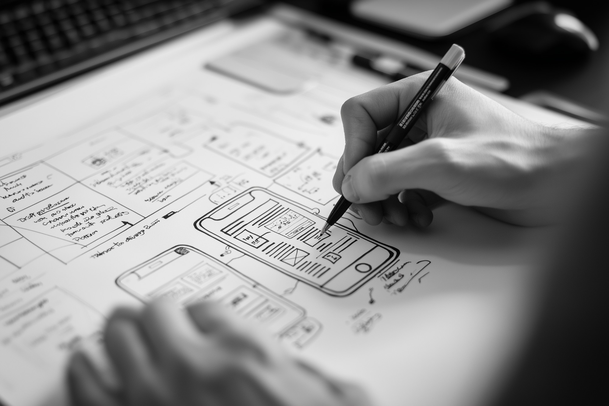
When you ask Midjourney for a logo, it gives you something objectively beautiful:
- Perfect symmetry
- Harmonious colors (golden ratio compliance)
- Balanced composition
- No visual tension
The Result: It looks great. But you scroll past it. You forget it 10 seconds later. Why?
The Science of Imperfection
Neuroscience research shows that our brains are wired to notice anomalies:
- Perfect symmetry: Processed quickly, dismissed as "safe"
- Slight imperfection: Triggers curiosity, longer attention, emotional response
- Handwritten elements: Activate empathy centers in the brain
- Authentic "flaws": Signal trustworthiness (too perfect = suspicious)
The Mona Lisa's fame partly stems from her slightly crooked smile. The Nike Swoosh breaks every typography rule. Apple's bitten apple is asymmetrical. Iconic designs break perfection deliberately.
Brands That Chose Imperfection
1. Mailchimp — The Quirky Illustrations
What They Did: Hired illustrators to create "wonky," hand-drawn characters with imperfect lines and exaggerated proportions.
Why It Works: In a sea of corporate SaaS companies with sterile visuals, Mailchimp feels human, approachable, fun.
The Impact: Brand recognition increased by 62%. Users describe the brand as "friendly" (competitor surveys show "professional" but "cold").
2. Oatly — The Deliberately "Bad" Copy
What They Did: Packaging copy full of run-on sentences, lowercase letters, casual tone: "Wow, no cow!" "It's like milk but made for humans."
Why It Works: Traditional milk brands use sterile, corporate language. Oatly feels like a friend texting you, not a corporation selling to you.
The Impact: $2 billion valuation. Brand loyalty off the charts. People tattoo Oatly slogans.
3. Supreme — The Box Logo "Mistake"
What They Did: The iconic red box logo is slightly off-center. Not by accident — it's deliberate.
Why It Works: Creates visual tension. Makes you look twice. Signals "we don't care about your design rules" (anti-establishment appeal).
The Impact: Most counterfeited logo in fashion. Resale market worth billions.
4. Notion — The Hand-Drawn Icons
What They Did: Instead of perfect vector icons, Notion uses slightly irregular, hand-drawn style icons throughout the UI.
Why It Works: Productivity tools feel robotic. Notion feels human. The "imperfect" icons make it approachable.
The Impact: 30M+ users. Community creates custom icons mimicking the hand-drawn style.
5. Duolingo — The Chaotic Owl
What They Did: Duo the owl has exaggerated expressions, inconsistent proportions, and sometimes looks "unhinged" (intentional meme fuel).
Why It Works: Language learning is boring. Duo is chaotic, unpredictable, funny. The "imperfection" makes it shareable.
The Impact: 10M+ TikTok followers. Duo is a cultural icon, not just a mascot.
The AI Dilemma: Can Machines Create Imperfection?
The Problem
AI is trained on millions of "good" designs. It learns patterns. It optimizes for perfection. When you prompt it to "add imperfection," you get:
- Artificial randomness: Random noise that doesn't look authentic
- Calculated "quirk": Imperfection that's too intentional (loses spontaneity)
- Aesthetic imperfection: Pretty mistakes, not real ones
The Uncanny Valley of Design
Just like robots that are almost-but-not-quite-human feel creepy, AI-generated "imperfection" feels fake:
- Real handwriting: Inconsistent pressure, natural tremor, personal quirks
- AI "handwriting": Mathematically irregular but lacks life
- Result: You can't explain why, but you know it's fake
AI is so good at perfection that when it tries to mimic imperfection, it fails. Real imperfection is unintentional. AI imperfection is calculated. You can feel the difference.
The 5 Types of Meaningful Imperfection
1. Craft Imperfection
What it is: Visible signs of human creation (brush strokes, pen pressure, material texture)
Example: Basecamp's hand-drawn illustrations, Innocent Drinks' doodle-style packaging
2. Asymmetry Imperfection
What it is: Deliberate off-balance composition that creates visual interest
Example: Spotify's dynamic album covers, MTV's chaotic logo animations
3. Vernacular Imperfection
What it is: Breaking design rules to match natural human communication
Example: Slack's casual error messages ("Hmm, we couldn't do that"), Discord's meme-heavy UI
4. Temporal Imperfection
What it is: Showing age, wear, or evolution over time
Example: Levi's distressed jeans, Instagram's "film grain" filters, Reddit's old-school UI
5. Personality Imperfection
What it is: Design that reveals brand character, even if "wrong"
Example: BrewDog's aggressive punk aesthetic, Cards Against Humanity's offensive packaging
How to Design Imperfection (The Right Way)
1. Start Perfect, Break Intentionally
Create a perfectly balanced design first. Then ask: "What would make this more human?" Break one rule. Shift one element. Add one hand-drawn touch.
2. Imperfection Must Serve Purpose
Don't add flaws randomly. Ask: Does this make the brand more approachable? More memorable? More authentic? If no, it's just messiness.
3. Study "Wabi-Sabi"
Japanese aesthetic philosophy: beauty in imperfection, impermanence, incompleteness. Embrace cracks, asymmetry, roughness. Not as flaws, but as character.
4. Use Real Analog Tools
Draw by hand. Scan it. Use real paint. Photograph textures. Digital filters mimic this, but real materials have soul AI can't replicate.
5. Test Emotional Response
Show your "imperfect" design to people. Ask: Does it feel warm? Trustworthy? Human? Or does it feel sloppy? If sloppy, you've failed.
Case Study: Handwritten vs AI "Handwritten"
The Experiment
A luxury hotel chain tested two versions of welcome notes in guest rooms:
Staff wrote personalized notes by hand. Took 2 minutes per note. Handwriting varied by staff member. Occasional spelling errors.
Custom font mimicked handwriting. Perfectly consistent. No errors. Took 10 seconds per note (print + sign).
The Results
- Version A (Real): 78% of guests mentioned the note in reviews. "Made me feel special."
- Version B (AI Font): 12% mentioned. "Nice touch, but standard."
- Cost Analysis: Version A cost 6x more staff time but generated 12x more positive brand sentiment
Guests didn't consciously know why the handwritten notes felt better. But they felt it. The inconsistent handwriting, the slight imperfections — these signaled "a real person cared." The AI font, despite looking similar, felt algorithmic.
The Future: Imperfection as Premium
Predictions for 2026-2030:
- 2026: "Human-made" certificates become standard for luxury brands (like "organic" for food)
- 2027: AI-perfection becomes the budget option; hand-crafted imperfection becomes premium
- 2028: Brands deliberately show "making-of" videos to prove human involvement
- 2029: Authenticity verification (blockchain-backed) for human-designed products
- 2030: Two-tier design market: mass AI-generated vs. artisan human-touched
By 2030, "perfectly generated by AI" will be the new stock photo — cheap, accessible, but forgettable. "Imperfectly made by human" will be the new luxury signifier. We'll pay premiums for flaws.
Perfect vs. Imperfect Design
| Aspect | Perfect Design | Imperfect Design |
|---|---|---|
| Emotional Response | Admiration, but distant | Connection, warmth, trust |
| Memorability | Low (blends with others) | High (stands out) |
| Brand Perception | Professional, corporate | Authentic, human, approachable |
| Cost | Lower (AI-automated) | Higher (human craft) |
| Best For | Mass market, functional | Premium, emotional brands |
| User Engagement | Low time spent | High time spent, sharing |
Conclusion: Embrace the Human
In an age of AI perfection,
imperfection is the ultimate luxury.
The future of design isn't about choosing between human and AI. It's about knowing when each is appropriate. Use AI for efficiency, scale, and speed. But when you need connection, emotion, and memorability — embrace imperfection. Show the brushstroke. Leave the asymmetry. Write by hand.
Because in the end, people don't remember perfect. They remember personal.
Perfection is forgettable.
Imperfection is unforgettable.
완벽함은 잊혀진다.
불완전함은 잊혀지지 않는다.
- Audit your designs: Where can you add humanity?
- Try one analog technique this week (hand-draw, paint, collage)
- Study brands that embrace imperfection (Mailchimp, Oatly, Notion)
- Break one design rule deliberately in your next project
- Ask: "Does this feel human?" If no, iterate
💬 댓글 0개
첫 번째 댓글을 남겨보세요!