스포티파이가 UI 선택을 경쟁적 정체성으로 만든 방법
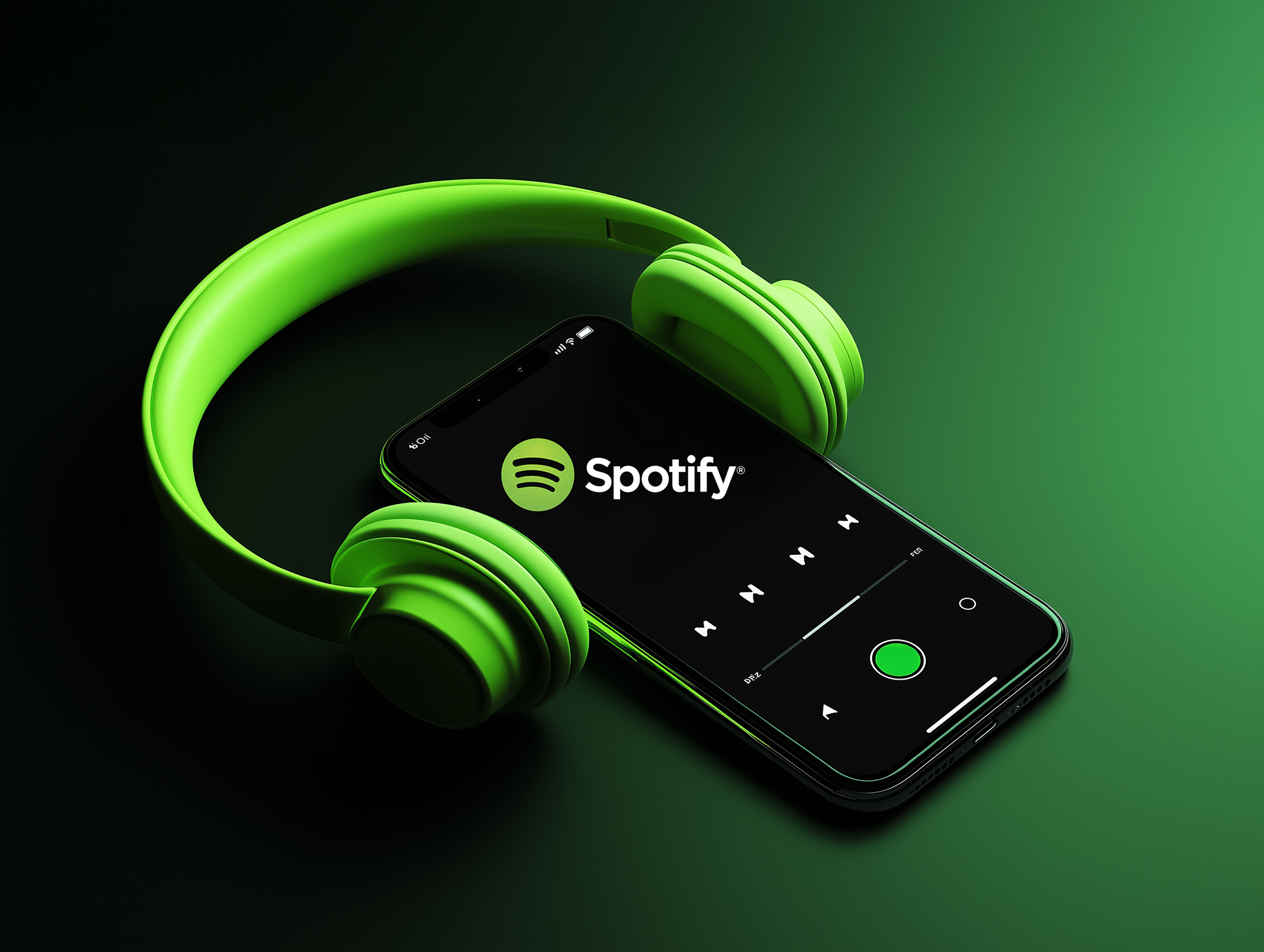
In 2014, while competitors chased light, minimalist interfaces, Spotify made a radical bet: paint it black. Not dark gray. Not charcoal. Pure, deep black. It was their first major redesign since launch, and it became so synonymous with the brand that Spotify never looked back. Today, users beg for light mode — and Spotify says no. This is the story of how a controversial design decision became an unshakeable brand identity.
2014년, 경쟁자들이 밝고 미니멀한 인터페이스를 쫓을 때, 스포티파이는 급진적인 베팅을 했다: 검은색으로 칠하기. 진한 회색이 아니라. 차콜이 아니라. 순수하고 깊은 검은색. 출시 이후 첫 주요 리디자인이었고, 브랜드와 너무나 동의어가 되어 스포티파이는 절대 돌아가지 않았다. 오늘날 사용자들은 라이트 모드를 간청한다 — 그리고 스포티파이는 거절한다. 이것은 논란이 된 디자인 결정이 흔들리지 않는 브랜드 정체성이 된 이야기다.
The 2014 Redesign: "Painting It Black"
The Problem Spotify Faced
Pre-2014 Spotify was a mess:
- Clunky desktop client with varying shades of gray and white
- Inconsistent design across platforms (mobile vs desktop)
- Too many buttons, too much clicking
- No clear visual hierarchy — everything competed for attention
- Felt outdated compared to sleeker competitors like Apple Music
Michelle Kadir, Director of Product:
"For devoted users, what the service offered in music selection, it lacked in the design department. It was the first major overhaul since 2006. It was overdue."
Testing Multiple Directions
The Process: Spotify tested several distinct designs with real users. They included:
- Light mode variations (white backgrounds)
- Gray mode variations (neutral tones)
- Dark mode variations (black backgrounds)
The Results:
"We surveyed our users and asked them if they had a preference of any of these designs. We didn't know what to expect. Overwhelmingly, the test-users preferred the darker look."
Why users preferred dark: When you have colorful, artistic cover art and beautiful photography, it shows more clearly on a dark background. White backgrounds create visual noise that competes with the content.
The Philosophy: "The Movie Theater Experience"
Michelle Kadir's Analogy:
"When you go to a movie theater, the lights dim. The movie, not the theater, becomes the experience. Spotify listeners should feel like that when they use the service."
The UI should disappear. The music, the album art, the artist photos — that's what deserves attention. Everything else should recede into the background.
The 6 Original Design Principles (2013-2014)
| Principle | What It Means | How Dark Mode Delivers |
|---|---|---|
| 1. Content First | Music and art should be the focus | Black background makes colorful album art pop |
| 2. Be Alive | Never stale, always fresh | First major redesign in 8 years felt revolutionary |
| 3. Get Familiar | Works on all platforms identically | Black + green became instantly recognizable everywhere |
| 4. Do Less | Intuitive, slick, simple | Fewer button types, monochromatic simplicity |
| 5. Stay Authentic | Core identity that's unique | Bold departure from industry norms |
| 6. Lagom | Swedish: Perfect balance, not too much/little | Black is extreme but balanced by vibrant content |
주요 변경: 노란색 즐겨찾기 별을 단순한 플러스(+) 기호로 교체했다. "더 미묘하다," Kadir가 설명했다, "디자인 측면에서 좀 더 현대적이다." 또한 새로운 단색 룩과 일치했다. 안녕, 노란색.
The Technical Execution: Pure Black (#000000)
Color System
Primary Colors:
- Black (#000000 / #191414): Background, surfaces
- Spotify Green (#1DB954): Primary actions, play buttons
- White (#FFFFFF): Primary text
- Gray shades (#B3B3B3, #535353): Secondary text, inactive elements
The Green Evolution (Accessibility Fix):
In 2015, Spotify launched their vibrant signature green. But they quickly realized it didn't work in UI — white text/icons on green had poor contrast. They created "UI Green" (darker) to fix this.
The 2020 Solution: Black on Green
Instead of using white on darkened green, they switched to black icons/text on original Spotify green. This achieved a 10.9:1 contrast ratio (way above WCAG AA standard of 4.5:1), making buttons more accessible while keeping the vibrant brand color.
Why Pure Black Works
| Benefit | Impact |
|---|---|
| Visual Hierarchy | Album art and photos become focal points — nothing competes |
| OLED Battery Saving | On OLED/AMOLED screens (iPhone, Samsung), black pixels = off pixels = 60%+ battery savings |
| Eye Comfort (Nighttime) | Reduces glare and eye strain in low-light environments |
| Premium Aesthetic | Feels sophisticated, exclusive, "entertainment-focused" |
| Brand Recognition | You see that black + green combo and instantly know it's Spotify |
The Pushback: "Give Us Light Mode!"
User Complaints (from 2014 onward):
- "It physically hurts my eyes" — ghosting effects, persistent images
- "I can't see anything" — dark grays and blacks look similar on some monitors
- "Too much spacing" — new layout felt bulky, required full-screen
- "Where's my old version?" — nostalgia for white backgrounds
Community Forum Requests:
Since 2014, users have created countless threads requesting light mode. The most popular:
- "[All Platforms] Light Mode option" — created 2014, still open
- "Light and dark mode options, or even color mode options" — created 2025
Spotify's Response (consistently):
"We don't have any immediate plans to implement this. We'll check back in here with a new status if we have any news to share."
Why Spotify Refuses to Add Light Mode
1. Brand Identity: Black + green IS Spotify. Changing it would dilute the brand recognition they've built.
2. Design Cohesion: Supporting two themes doubles maintenance. Every design decision must work in both modes.
3. Content-First Philosophy: Dark mode objectively makes colorful content pop more. It's not just aesthetic — it's functional.
4. Competitive Differentiation: In a sea of white apps, Spotify stands out. Light mode would make them generic.
트레이드오프: 스포티파이는 일부 사용자가 다크 인터페이스로 진정으로 어려움을 겪는다는 것을 안다 (난시, 광과민성). 하지만 그들은 더 강한 브랜드 정체성을 유지하는 것이 그 사용자들을 희생할 가치가 있다고 결정했다. 논란의 여지가 있는 입장이지만, 효과가 있었다.
The Results: Dark Mode as Competitive Moat
| Metric | Pre-2014 | Post-2014 | 2025 |
|---|---|---|---|
| Users | 24 million | 60 million | 640 million+ |
| Brand Recognition | Generic music app | Instantly identifiable | Cultural icon |
| Competitors | Pandora, Rdio | Apple Music launch (2015) | Still #1 streaming service |
| Visual Identity | Forgettable | Polarizing but memorable | Unmistakable |
Industry Impact:
After Spotify's success, dark mode became an expectation, not a novelty:
- YouTube (2018): Added dark mode
- Twitter (2019): Lights Out mode (pure black)
- iOS 13 (2019): System-wide dark mode
- WhatsApp, Instagram, Facebook (2019-2020): All added dark modes
But none committed as hard as Spotify. Others offer choice. Spotify says: "This is who we are."
6 Lessons from Spotify's Dark Mode Strategy
Lesson 1: Bold Choices Create Identity
Spotify could have offered both light and dark modes. Instead, they made a polarizing decision. Polarizing beats forgettable. If everyone likes your design, no one loves it.
Lesson 2: Let Content Lead
Dark backgrounds are only appropriate when your content is colorful and visual. Spotify's strength is music and album art. Black makes that pop. If you're content-heavy (like Medium or Wikipedia), light mode makes more sense.
Lesson 3: Test with Real Users
Spotify didn't guess. They tested multiple designs and let data guide the decision. Overwhelmingly, users preferred dark. Trust your research, not your assumptions.
Lesson 4: Accessibility Can't Be Ignored
When Spotify Green + white text failed contrast ratios, they fixed it. Black text on green achieved 10.9:1 contrast. Design boldly, but meet accessibility standards. It's not negotiable.
Lesson 5: Not All Feedback Deserves Action
For 11+ years, users have begged for light mode. Spotify says no. Sometimes, protecting your vision means saying no to customers. You can't please everyone — and you shouldn't try.
Lesson 6: Brand Consistency > User Preference
Spotify chose brand identity over customization. This trade-off is controversial but strategic. A strong, recognizable brand beats a flexible, generic one. Black + green IS Spotify.
Conclusion: When Design Becomes Strategy
Spotify's dark mode isn't just a UI preference — it's a strategic decision that became inseparable from the brand. In a world where every app looks the same, Spotify chose to look different and never wavered. They turned a controversial design into a competitive advantage.
스포티파이의 다크 모드는 단순한 UI 선호도가 아니다 — 브랜드와 분리할 수 없게 된 전략적 결정이다. 모든 앱이 똑같아 보이는 세상에서, 스포티파이는 다르게 보이기로 선택했고 절대 흔들리지 않았다. 그들은 논란의 여지가 있는 디자인을 경쟁 우위로 바꿨다.
You can't see Spotify's black interface
without thinking of Spotify.
That's not design.
That's brand lock-in.
스포티파이의 검은 인터페이스를 보면
스포티파이를 생각하지 않을 수 없다.
그것은 디자인이 아니다.
그것은 브랜드 락인이다.
Dark mode works for Spotify because music is visual entertainment. But it's not a universal solution. Ask yourself: Does my content benefit from a dark background? Or does it need bright clarity? The answer should drive your design, not trends. Spotify succeeded not by following dark mode trends — they created them. And then they never looked back.
다크 모드는 음악이 시각적 엔터테인먼트이기 때문에 스포티파이에게 효과가 있다. 하지만 보편적 솔루션은 아니다. 스스로에게 물어보라: 내 콘텐츠는 어두운 배경에서 이익을 얻는가? 아니면 밝은 명료함이 필요한가? 답이 트렌드가 아니라 디자인을 이끌어야 한다. 스포티파이는 다크 모드 트렌드를 따라서가 아니라 — 그것을 만들어서 성공했다. 그리고 절대 뒤를 돌아보지 않았다.
💬 댓글 0개
첫 번째 댓글을 남겨보세요!