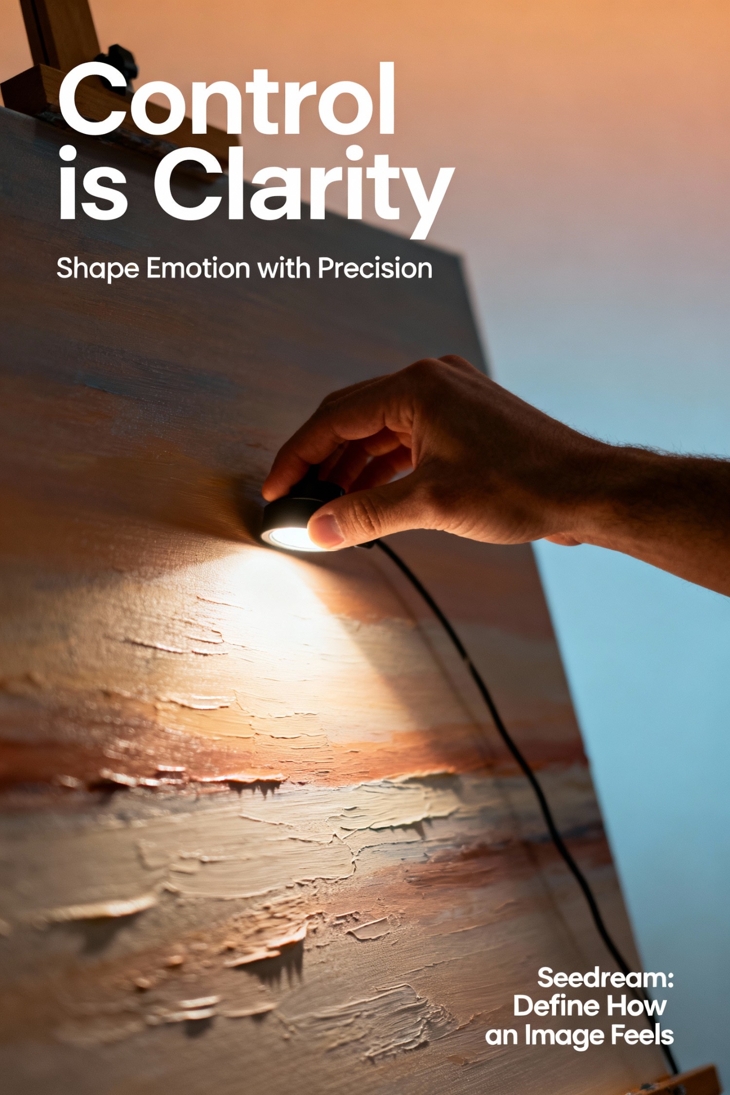
Part 1 | Concept — The Philosophy of Control
In design, control is not about restriction — it's about clarity. Seedream doesn't just generate visuals; it gives you the ability to define how an image feels, not just how it looks. Through lighting, tone, and subtle texture, designers can shape emotion with precision.
디자인에서 '통제'는 제약이 아니라 '명확함'이다. Seedream은 단순히 이미지를 만드는 도구가 아니라, 이미지가 '어떤 감정을 전달할지'를 설계할 수 있는 도구다. 조명, 톤, 질감의 조합을 통해 디자이너는 감정을 정밀하게 다룰 수 있다.
Part 2 | Practice — How to Master Visual Control in Seedream
실무 가이드: Seedream에서 감정 중심의 시각 제어를 구현하는 법
1. Think Like a Colorist, Not a Technician
In Seedream, light and tone are emotional tools, not technical sliders. Before adjusting brightness or exposure, ask yourself — "What does this tone communicate?"
Seedream에서 빛과 톤은 기술적 수치가 아니라 감정의 언어다. 밝기나 노출을 조정하기 전에, "이 톤은 어떤 감정을 말하고 있는가?"를 먼저 물어야 한다.
- Soft Diffused Light → Calm, premium tone
(부드러운 확산광 → 차분하고 프리미엄한 톤) - Cinematic Contrast → Strong focus and clarity
(시네마틱 대비 → 강한 집중과 명료함) - Golden Hour Light → Warm, human emotion
(골든 아워 빛 → 따뜻하고 인간적인 감정)
2. The Language of Shadow
Shadows are not absence — they are structure. A designer who understands shadow can control the viewer's trust. Soft shadows suggest warmth and approachability; hard shadows evoke power and discipline.
그림자는 '부재'가 아니라 '형태'다. 그림자를 이해하는 디자이너는 보는 사람의 신뢰를 통제할 수 있다. 부드러운 그림자는 따뜻함과 친근함을, 단단한 그림자는 힘과 절제를 표현한다.
- Soft Edge Shadow → emotional depth
(부드러운 경계의 그림자 → 감정적 깊이) - Hard Edge Shadow → professional tone
(단단한 경계의 그림자 → 전문적인 톤) - Gradient Shadow → natural realism
(그라데이션 그림자 → 자연스러운 리얼리즘)
3. Balancing Saturation and Realism
Seedream allows precise tonal balance. Over-saturated colors may look impressive at first, but they often break realism. Instead, reduce intensity — let the image breathe.
Seedream은 정밀한 색 밸런스를 가능하게 한다. 채도가 높은 색은 처음엔 눈에 띄지만, 현실감을 무너뜨릴 때가 많다. 오히려 채도를 줄여서 '숨 쉬는 색'을 만들어라.
10~15% 정도 채도를 낮추면 프리미엄스럽고 자연스러운 톤이 완성된다.
4. The Harmony of Reflection
Reflection defines how tangible an image feels. In Seedream, reflection is not just a light effect — it's the link between realism and emotion. Matte reflections feel authentic, glossy reflections feel modern, and soft gradient reflections feel cinematic.
반사는 이미지가 얼마나 '손에 잡히는가'를 결정한다. Seedream에서 반사는 단순한 빛의 효과가 아니라 '리얼리즘과 감정'을 이어주는 다리다. 매트한 반사는 진정성을, 유광 반사는 현대적 감각을, 그라데이션 반사는 영화 같은 여운을 만든다.
- Matte Reflection → Authentic, trustworthy
(매트 반사 → 진정성 있고 신뢰감 있는) - Glossy Reflection → Modern, sleek
(유광 반사 → 현대적이고 세련된) - Soft Gradient Reflection → Cinematic, emotional
(부드러운 그라데이션 반사 → 시네마틱하고 감성적인)
Practical Prompt Example (Seedream)
(한국어 번역:)
부드러운 확산광 아래 제품의 시네마틱한 정지 이미지,
은은한 반사광, 골든 아워 톤, 사실적인 질감,
균형 잡힌 대비, 미니멀한 구도, 흰 배경
Visual Control Quick Reference
| Element | Emotional Effect | Use When |
|---|---|---|
| Soft Diffused Light | Calm, approachable | Premium lifestyle brands |
| Cinematic Contrast | Focused, dramatic | Hero products, luxury items |
| Golden Hour Tone | Warm, human | Emotional storytelling |
| Soft Shadow | Trustworthy, gentle | Healthcare, wellness brands |
| Hard Shadow | Strong, professional | Tech, corporate brands |
| Reduced Saturation | Natural, premium | Minimalist, high-end products |
| Gradient Reflection | Cinematic, refined | Editorial, artistic projects |
Conclusion
The art of control is the art of emotion. When a designer can shape light, tone, and reflection with intention, the result is not just realistic — it's emotionally alive.
통제의 예술은 곧 감정의 예술이다. 빛, 톤, 반사를 의도적으로 설계할 수 있을 때, 이미지는 단순히 '리얼'한 것을 넘어 '감정이 살아 있는 장면'이 된다.
Master the elements of light, shadow, and color —
and you master the language of visual emotion.
빛, 그림자, 색을 마스터하면,
당신은 시각적 감정의 언어를 마스터하는 것이다.
💬 댓글 0개
첫 번째 댓글을 남겨보세요!