Practice — How to Direct AI Images Like a Designer
실무 가이드: 미드저니에서 디자이너처럼 프롬프트를 연출하는 법
1. Write Prompts Like a Director, Not a Tourist
Most users describe what they see.
Designers describe what they feel.
대부분의 사용자는 눈에 보이는 것을 묘사하지만,
디자이너는 느껴지는 것을 연출한다.
"a product on a white background"
"a product glowing under diffused morning light, soft reflection, serene tone"
The second version doesn't describe — it directs.
It tells the AI how the scene should breathe.
두 번째 문장은 단순히 묘사하는 게 아니라, 연출을 지시한다.
장면이 어떤 감정으로 "숨 쉬어야 하는지"를 알려준다.
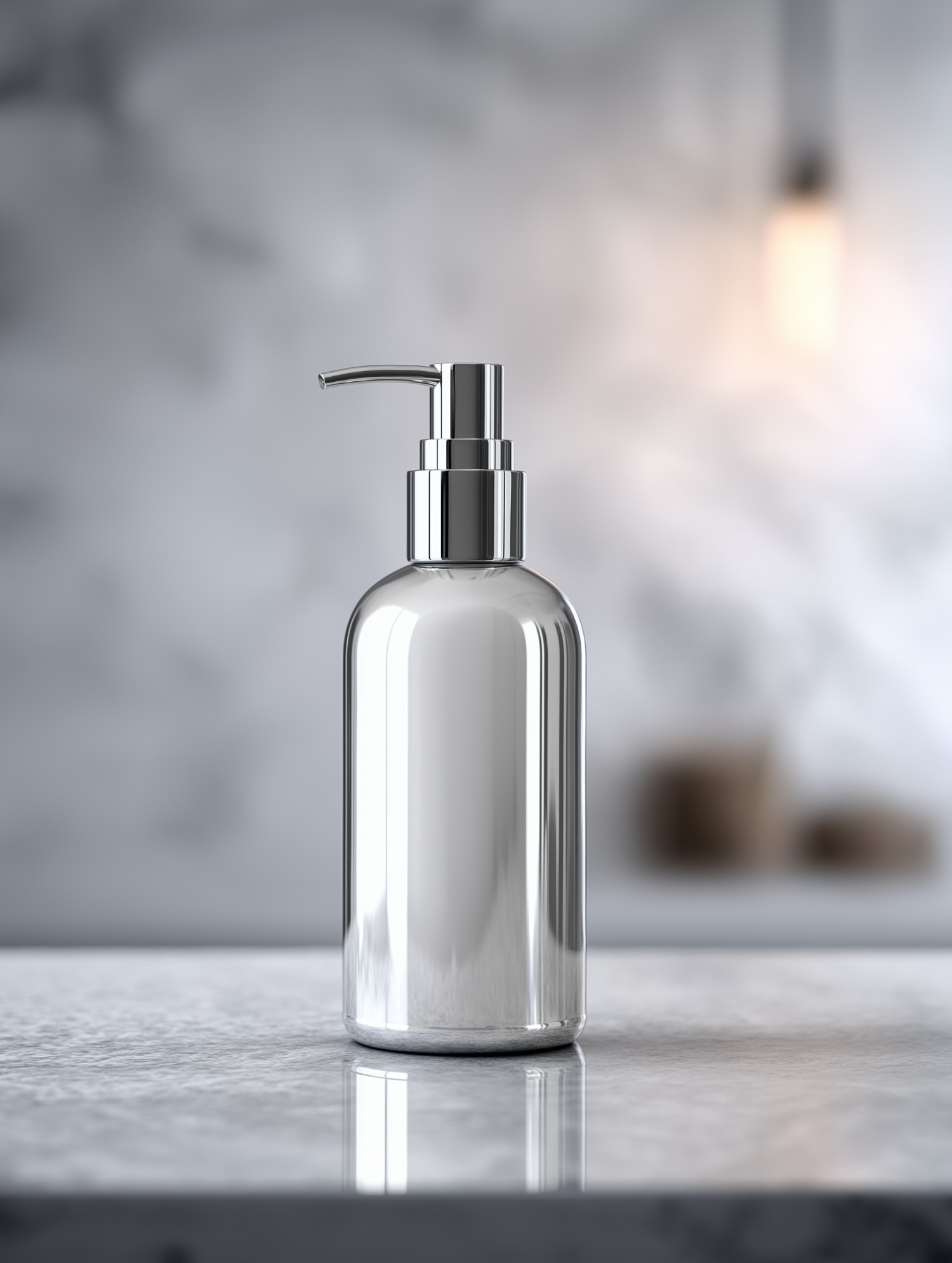
2. Control Lighting as Your Visual Language
Lighting in Midjourney is the fastest way to control emotion.
Small changes in light direction or texture can redefine the entire tone of your image.
조명은 미드저니에서 감정을 통제하는 가장 빠른 방법이다.
조명의 방향이나 질감이 조금만 달라져도 이미지의 감정이 완전히 달라진다.
Practical reference:
| Lighting Keyword | Emotional Effect | Example Usage |
|---|---|---|
| soft cinematic lighting | calm, elegant, timeless | premium or emotional products |
| hard directional light | bold, focused, modern | tech, luxury, or contrast-heavy images |
| backlit glow | pure, emotional, dreamlike | lifestyle, organic brands |
| studio lighting | precise, professional | product showcase, catalog look |
If you want a human, natural feeling — combine:
"soft light + shallow depth of field + gentle contrast"If you want modern minimalism — use:
"hard light + clean shadow + high-key tone"
감정적인 이미지를 원한다면
"부드러운 빛 + 얕은 심도 + 낮은 대비"현대적 미니멀 이미지를 원한다면
"강한 빛 + 명확한 그림자 + 밝은 하이라이트"이 조합이 효과적이다.
3. Build Composition Through Camera Terms
Designers use the camera like a storyteller.
Instead of describing an object, define where the viewer stands.
디자이너는 카메라를 이야기의 도구로 쓴다.
물체를 묘사하는 대신, 관객의 시점을 설계한다.
| Camera Term | Visual Effect | When to Use |
|---|---|---|
| wide angle | space, openness, freedom | environment or storytelling shots |
| close-up | intimacy, detail | product focus or emotion scenes |
| low angle | power, luxury, scale | hero or flagship images |
| top view / flat lay | order, balance | editorial, lifestyle brands |
결과물은 단순한 제품 이미지가 아니라,
감정이 있는 장면(scene)으로 완성된다.
4. Use Visual Tension, Not Random Chaos
The secret to professional-looking AI design
is not about realism — it's about controlled imperfection.
전문 디자이너가 만든 AI 이미지가 다른 이유는
사실적이기 때문이 아니라,
의도적으로 불완전함을 조절하기 때문이다.
Leave slight asymmetry, imperfect reflections, or texture variation.
Those imperfections create visual rhythm — they make the image believable.
살짝 비대칭적인 구도, 완벽하지 않은 반사광,
질감의 미세한 차이가 시각적 리듬을 만들어낸다.
그게 이미지를 "진짜처럼" 느끼게 한다.
5. Create a Consistent Visual System
Professional designers don't make one perfect image —
they build a series that feels coherent.
전문 디자이너는 한 장의 완벽한 이미지를 만드는 게 아니라,
일관된 세계관을 가진 시리즈를 만든다.
Keep your tone, light, and perspective consistent across generations.
That's how brands are born in AI design.
조명 톤, 색감, 구도를 일관되게 유지해야
AI 결과물 안에서도 브랜드의 일관성이 생긴다.

Quick Checklist for Designers
| Element | Question to Ask | Purpose |
|---|---|---|
| Light | What emotion should this light evoke? | Defines tone |
| Composition | Where is the viewer standing? | Guides attention |
| Texture | Is it tactile or distant? | Adds realism |
| Color | Does it match the brand tone? | Creates consistency |
When you direct AI with intention,
you're not generating — you're designing.
의도를 가지고 AI를 다루면
그건 단순한 이미지 생성이 아니라, 디자인 행위가 된다.
💬 댓글 0개
첫 번째 댓글을 남겨보세요!